World Bank Big Data Project using Tableau
Background
The World Bank Big Data Project pertains to the entire educational public and private school data for the biggest province of Pakistan, Punjab for the year 2015, 2016 and 2017. The three year period serve a purpose to compare progress or lack thereof between the years and correlate the data with policies enacted each year. The dataset has petabytes of data stored in different tables across various databases with complicated data formats. The job of the data detective is to sift through it using SQL.
Tableau
Here we will use the Enterprise Data Visualization tool Tableau which allows us to join multiple tables within a database using their visual datastructure tool. It has a query builder for write custom SQL queries to filter data by date (day, month, year). Tableau utilizes OpenStreetMap to filter data by geographic coordinates (latitude, latitude). Tableau also lets you create your own custom calculations which are beneficial when you are playing with ratios, percentages, mean, median or mode. Tableau also allows the user to filter, hide and edit fields, rows and values.
Summary
This is just a snapshot of the individual graphs which are part of a comprehensive dashboard with statistics, graphs, widgets, maps, bubbles, and heatmaps. The full World Bank dashboard has 5 variations and has over 40+ graphs.
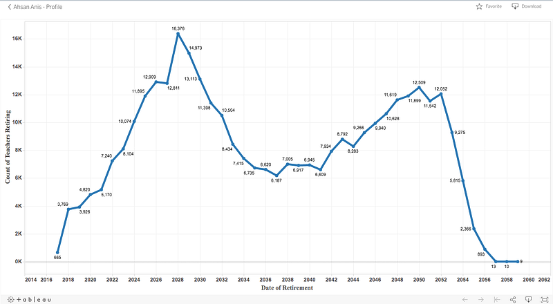
Number of Teachers Retiring till Year 2060
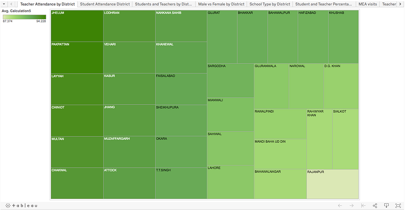
Percentage of Teacher Attendance by District
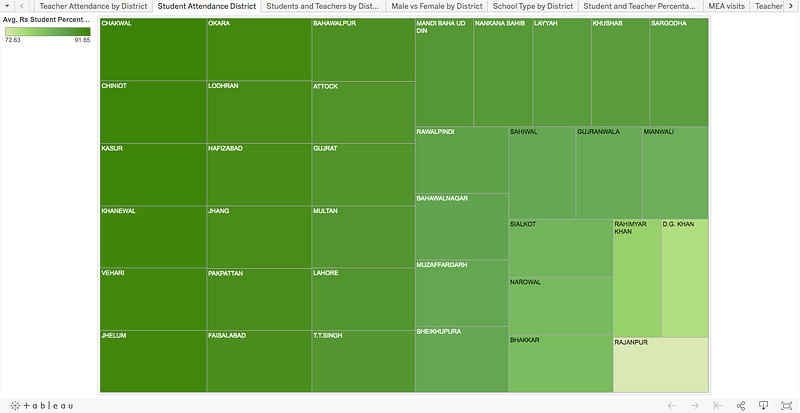
Percentage of Student Attendance by District
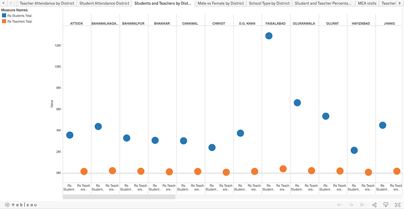
Total Number of Teachers and Students per District
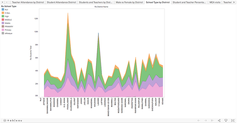
Type of Schools by Category
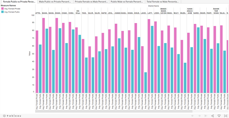
Comparison Between Number of Female Private and Public Schools
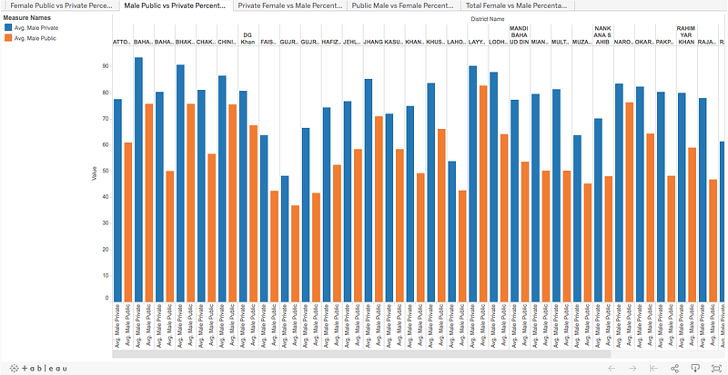
Comparison Between Number of Male Private and Public Schools
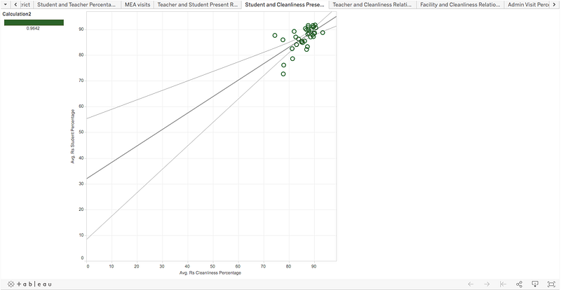
Correlation Between Student Attendance and School Cleanliness
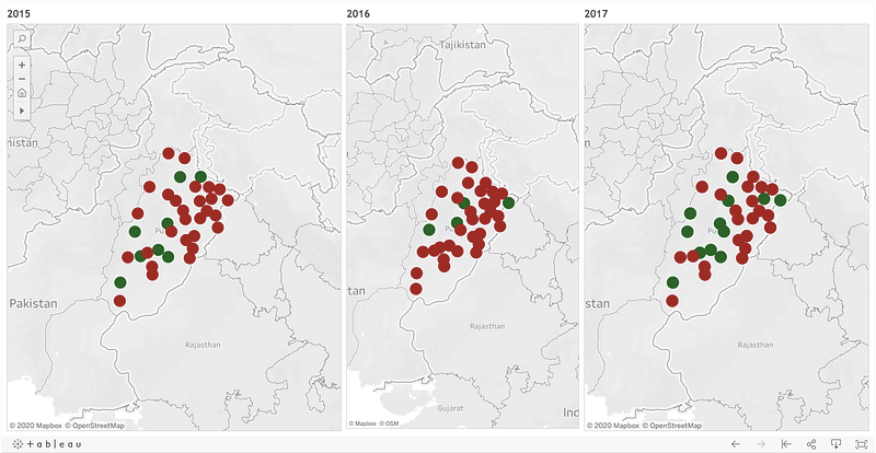
Comparison Between English Test Pass (Green) or Fail (Red) by District for the Year 2015, 2016 and 2017
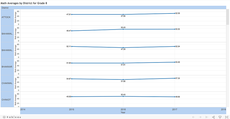
Comparison Between Math Test Percentage for the Year 2015, 2016 and 2016